All work
Brand identity · Healthcare
11MED
A visual identity for a health management platform, designed to make connected care feel clear, human and dependable.
The logo concept
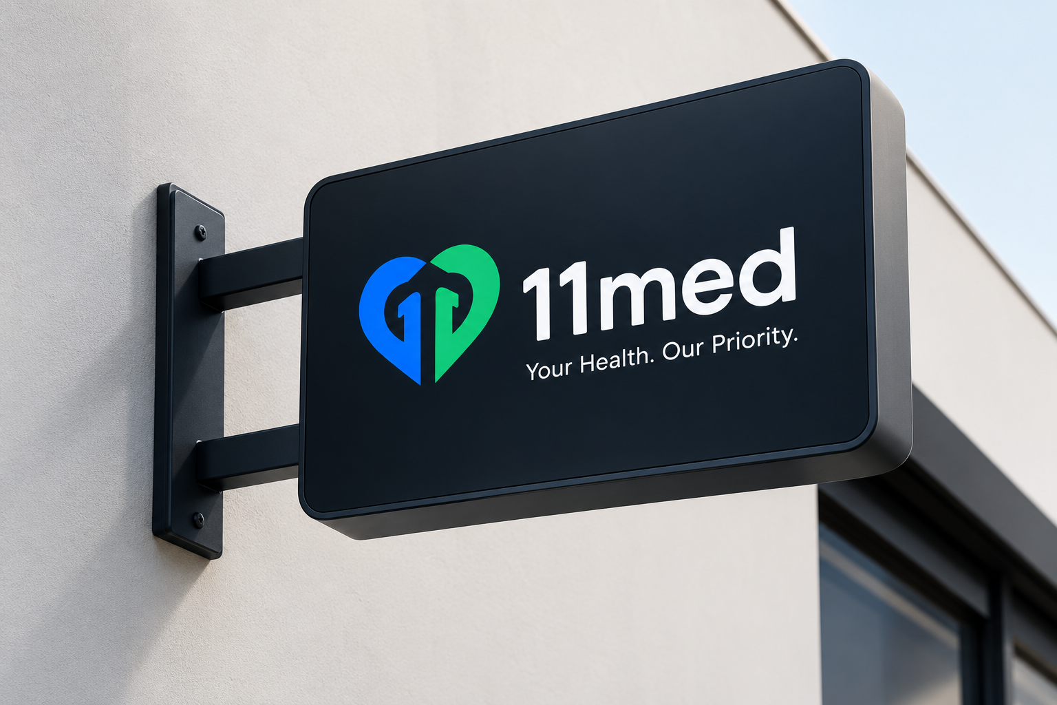
An anchor. A heart. A hidden 11.
The 11MED logo combines healthcare, stability, identity and subtle symbolism into one mark. At its core, an anchor sits within a heart, representing stability, trust, support and care in healthcare management.
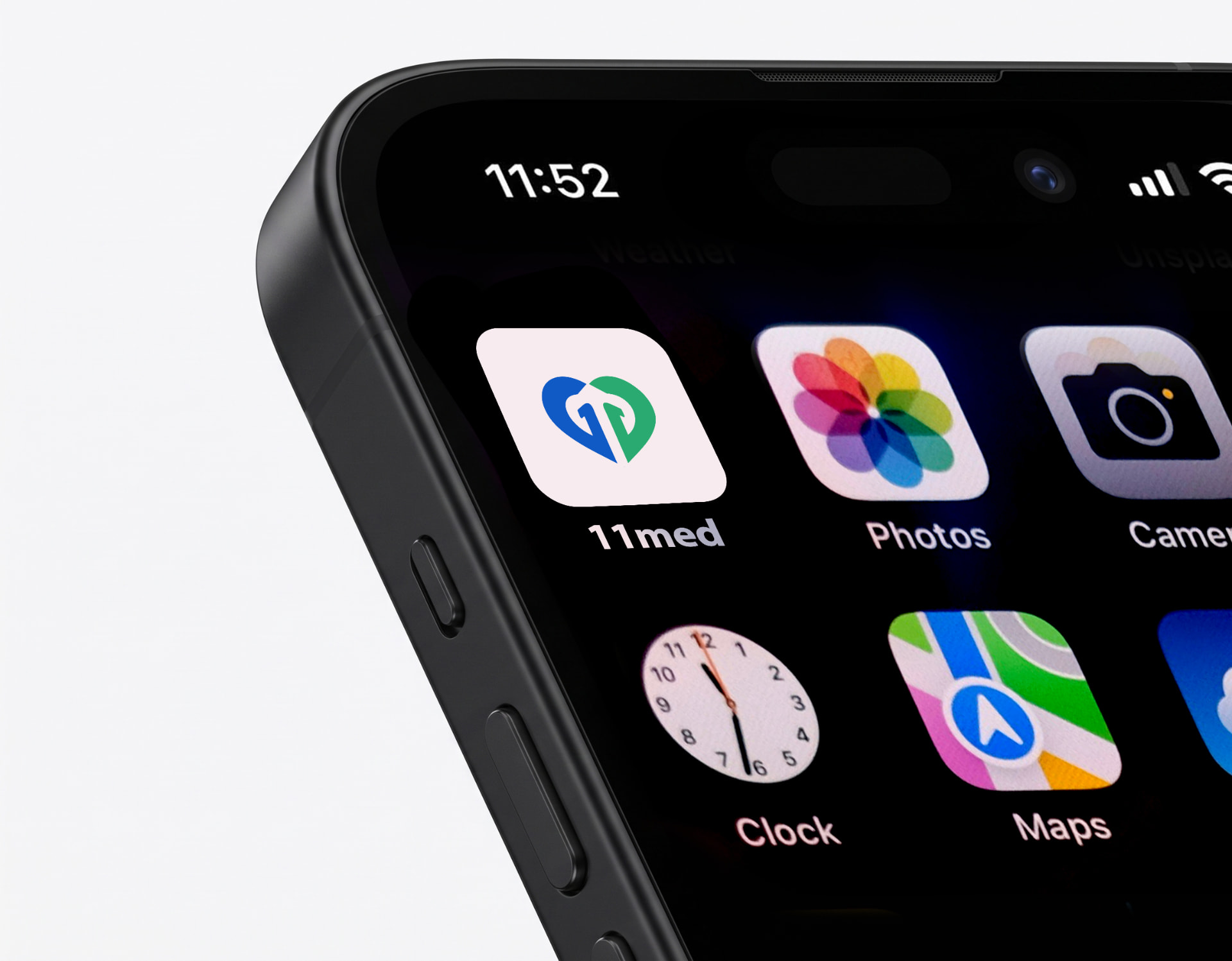
The anchor cleverly forms two hidden, custom-created “1” shapes facing opposite directions. Together, they create the “11” in 11MED while keeping the symbol unified and memorable.


11MED in context
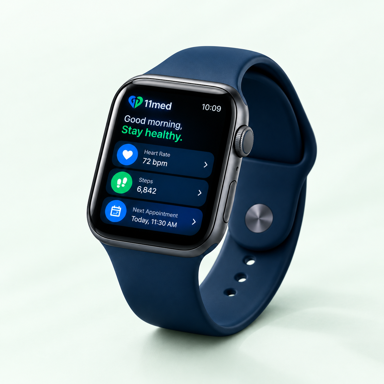
Designed for everyday health.
Have a healthcare brand to shape?
Let’s create an identity people can trust.